Circle Graph Template and How to Create It
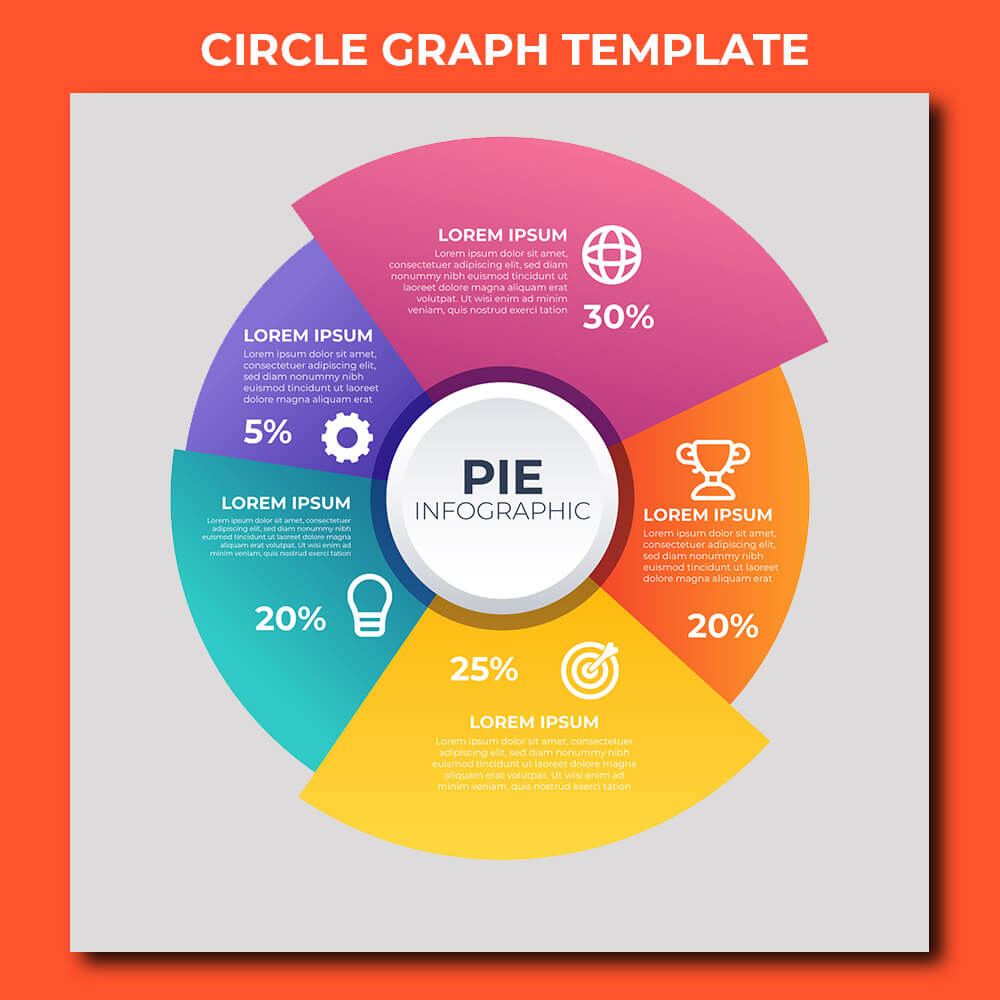
We have often studied a circle graph template in school. They are usually used to illustrate statistics at work. This kind of graph is also well known as a pie graph. It is a circular illustration that looks like a pie. Each slice of the circle or pie represents a category of data.

What Is a Circle Graph Template?
A circle or pie chart template is a circle-shaped chart that comes with wedge-shaped sectors each illustrating proportions. The total value of the circle should equal 100%. Each wedge is a part of the circle. With its simple design, this chart is easy to read.
- Social Studies Teacher Job Description and Its FAQ
- Optometric Technician Job Description and Its FAQ
- Draftsman Job Description and Its Responsibilities
- Certified Nurse-Midwife Job Description and Its FAQ
- Cabinet Maker Job Description and Its FAQ
That is why this kind of chart is often used in education. It is also commonly used for business presentations in order to represent the proportions across various categories such as segments of populations, answers to surveys, expenses, and others.
What Data Can You Represent on a Circle Graph Template?
Some examples of data you can present with a circle-shaped graph template include:
- Data you can present with a small table
- Data you can classify into nominal & ordinal categories
- Data that is either percentage or proportional
- Data involving 6 or fewer categories

What Aspects Do You Consider when Creating a Circle Graph?
When creating a pie-shaped graph template, you should consider a few aspects:
- What it means
It should come with meaningful concepts. Keep in mind that it should make sense with a single glance easily!
- Exclusivity
Don’t make mistake of setting exclusive parts, percentages, or numbers into the circle chart. You can reset your data or consider another kind of chart.

- The purpose
You should use this kind of chart to show the relationship between partial & overall elements. It is effective for categorical data groups because each wedge shows a specific category.
- The value of the date
A circle graph chart template is generally used for 6 or fewer sets of values. Too many can cause difficulty in reading. You also cannot use it for negative or zero values.
- No axes
Don’t use this kind of chart or graph if you would like to present data trends!
How to Make a Circle Graph Template
How to create a circle graph can be done with different methods:
- Using Ms. Excel
Ms. Excel is one of the best tools used to make a circle graph. You just need to go to Chart and choose Pie Chart to create it.
- Using Ms. Word
It is also easy to create a circle chart using Ms. Word. Just click the “insert” tab, continued with “Chart” button, and choose “Pie”. Then, you can select your desired style of the graph or chart.
- Drawing your circle graph template
You can manually draw it using a mathematical compass. However, it will take a lot of time & effort.

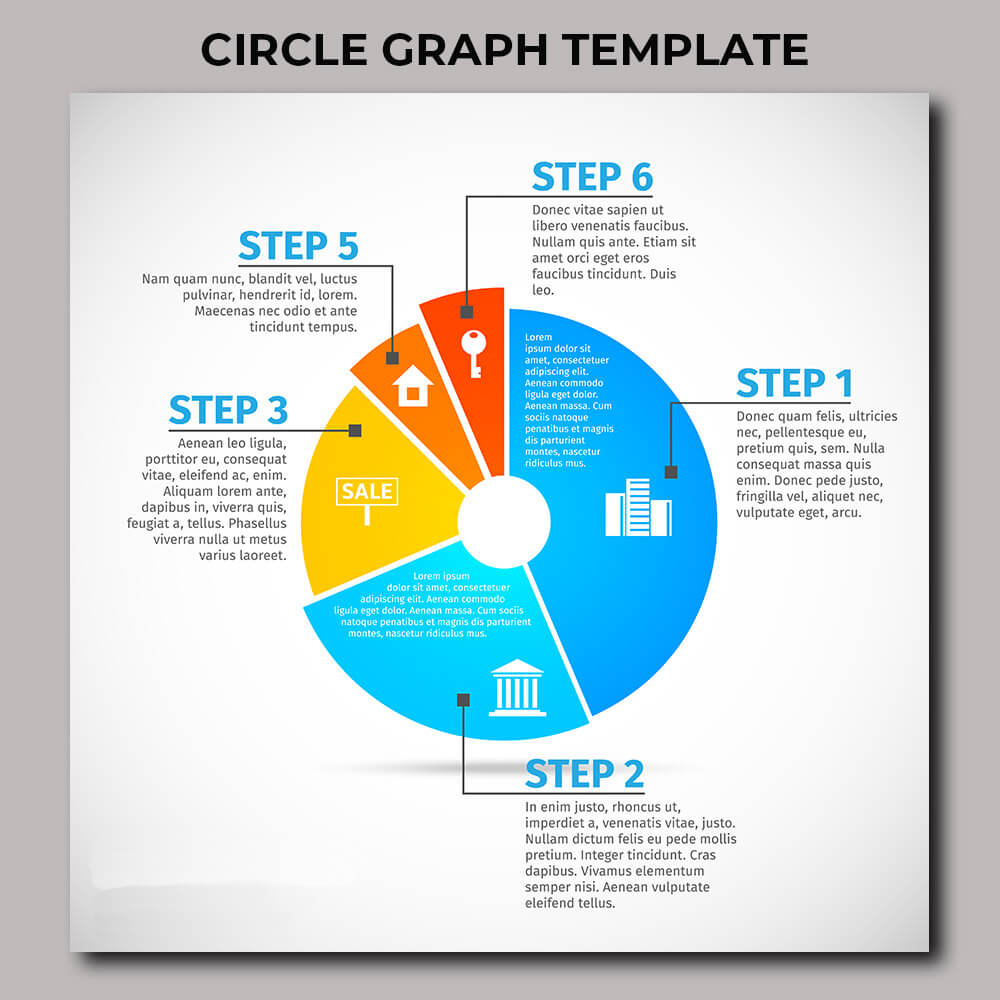
If you want to create it effortlessly, it is a god idea to use our circle graph template. Since our templates are customizable, you are allowed to change its color, data, text, etc. using Adobe Photoshop or any other editing tool.

