Tips on Designing the Visitor Guest ID Card
You may have a big client to meet today. Be prepared and make a great first impression. You will visit the VIP client in the big company, and of course, the CSO is going to give you a visitor guest ID card. To design a prestigious visitor ID card, you will need to keep your eyes open on this article.

Visitor Guest ID Card Elements
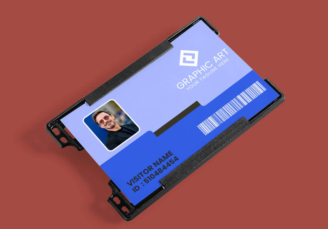
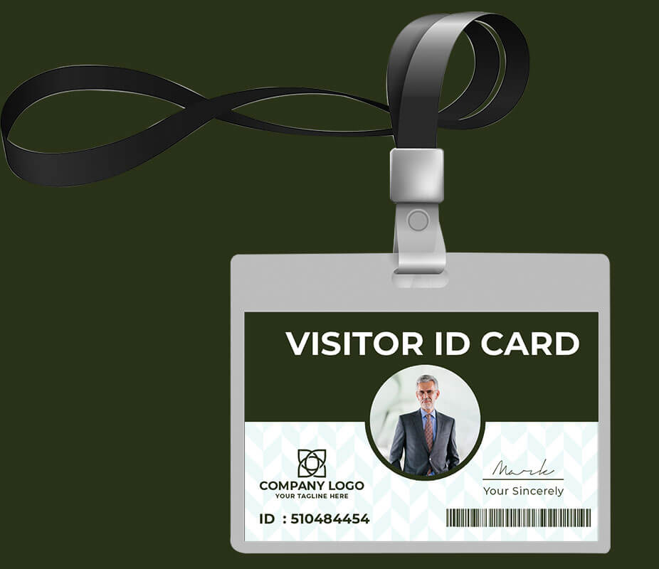
- Company’s Logo
It is suggested to add a visual security element to the employee or visitor guest ID card by incorporating your company’s logo. Make sure your company’s ID card design represents the professional image.
- Picture or Photo
It is a must to include a photograph of the company’s employee on the front of the ID card. Although the photos are not strictly required on visitor guest cards, the company may usually ask for the visitor’s ID card.
- Data Encoding
Mostly, ID cards include encoded information about their holders by using barcodes, magnetic stripes, and chips. These will help the company to synchronize the card holder’s identification with building access or attendance.
- Personal Information
Since an ID card has limited space, the personal information displayed has to be the most necessary one. Commonly, ID cards will show the holders’ names, position or department, and employee or visitor number.
PSD Visitor Guest ID Card Design Don’ts
- Don’t Choose Flat Colors
Avoid using flat colors. By adding a little texture or gradient, it may help your visitor guest ID card look newer for longer.
- Don’t Choose Dark Colors
Yes, the point is to see the cardholder’s name. That’s why the contrast is important to it. You won’t choose to frighten your visitor with dark gloomy cards, right? If you are worried about contrast around the name, adding a darker color around the text may be helpful.
- Don’t Use Funky Fonts
Remember again that the major function of an ID card is identification. Funky fonts might not work well. Just choose simple fonts and legible from a distance.
- Don’t Use Too Many Straight Lines
Adding a little curvature will help ID photo pop out more. That curvature may give a better impression of your company as well.

PSD Visitor Guest ID Card Design Do’s
- Do Put the Necessary Content
It should provide the cardholder’s information at a glance. Any related important information can be added on the back of the card.
- Do Use the Proper Fonts and Colors
Use colors to distinguish each visitor, such as green color for meeting the financial department, etc. Most importantly, use simple fonts to make your personal information readable.
- Do Decide the Orientation
If your company’s logo or cardholders’ names are long, it is better to utilize a horizontal ID card.
- Do Understand the Usage
Are you going to punch a hole for the clip on the card? Place your company’s logo or photo away from the hole area to avoid missing important information. Pay attention to the placement of the magnetic stripe if the card will be swiped on a reader.
PSD Visitor Guest ID Card Templates
Whether you are designing the visitor guest ID card yourself or working with a pro graphics designer, you can still look for PSD ID card templates, and choose the best one. Since the ID card represents your company’s professional image, make sure it captures your guests’ hearts whenever they come. 
